 I’ve been an admirer of Hanrose for a little while now, so you can imagine my delight when Johanna at Hanrose was happy to talk to me about the packaging of her beautiful candles and photoart. I think packaging is so interesting and adds such a lot to the overall experience, and as companies like Hanrose prove, it’s the little details that make it special. **Spoiler alert – a video review will also be available soon**
Tell us a bit about your brand and what you do…
Hanrose was created simply from a Christmas gift I wanted to make for someone! The photographic letter idea is not a new concept, but nobody does else does it; well not in the UK anyhow!
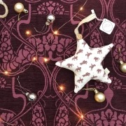
The Christmas decorations were rather special last year. I decided to improve them from the previous wood version to metallic and glitter infused acrylic. I’ve also produced the Willberry Decorations for the past two years. All profits go to the Willberry Wonder Pony charity and I love seeing pictures customers post of them hanging on their trees.
The Quote Posters & Cards came about from posts I used for Instagram etc. Someone asked if that’s what they were, so I produced them!
Can’t remember where the candle idea came from (I’m always thinking of ideas!) but it definitely was a lightbulb moment! I get so excited when I think of a great name, however Unicorn Fluff was thought of by one of the Twitterherd, I just matched it to the candy floss scent; and as promised I sent her the first one.
Let’s start with your branding – how did you decide on your logo, the colours and your branding overall?
Recently rebranded due to the candles. My first logo was actually created from the Photoart. I have a giant one in my workshop.
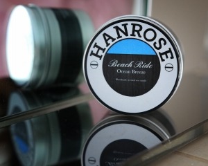
As I started to add new collections it changed to a very simple text version. I’ve I always wanted a round logo and when the time came for the candle tins to be designed, there it was. (I’ve still got my original drawing on a green post it, stuck on to one of the candle tins)
How did you decide on your packaging? What elements did you consider?
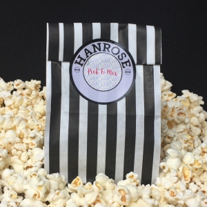
The hay idea for packaging was another lightbulb moment and ties in perfectly with the equestrian theme, plus doing my bit for the environment. The popcorn idea came when selecting the the bags for the wax melts.
What kind of response have you received to your packaging?
Everyone appears to love the hay their candles are nestled in and the popcorn has got people talking! I’m sure there will be a few more options to follow.
Do you think packaging adds to a product and the customer experience? Was this something you factored into your product quite early on or something that has evolved over time?
From the lovely comments I receive, I feel the packaging does add to the customer experience. We often like things and never contact the company to say, so when people post pictures etc I know I’ve put a smile on their face. I love the fact that the packaging for the candles & wax melts is quirky. The luxury of being in control is, I can do what I want, when I want. It’s always evolving, if I think of something new I usually do it. Just like the popcorn, off I went to buy a popcorn maker and a box of kernels!
Are there any other brands who have packaging that inspires you? Or that you think is done really well?
I simply adore fancy packaging, gorgeous boxes with embossed writing & bows. The packaging that the larger businesses can provide, which get you excited before you even open it!
Anything else you’d like to add?
I would just like to say thank you, it was great to see your reaction when opening your Hanrose parcel. Watch this space, my light bulb moments usually go into production and a new product could appear at anytime!
Find Johanna and Hanrose online here…




Leave a Reply
Want to join the discussion?Feel free to contribute!