
After seeing Atlas & I at Badminton Horse Trials and then seeing the video included in here on Facebook, I had to drop Sophie an email and find out more about her brand, her packaging and what inspires her.
Atlas & I Atlas & I packaging demo (click to see!)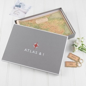
Tell us a bit about Atlas & I and what you do
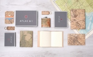
At Atlas & I we create gifts that tell your story. From a photo album printed with a vintage map of where you got married or went on your honeymoon to a congratulatory gift of a silhouette created from a photo of someone completing a gruelling challenge.
Let’s start with your branding – how did you decide on your logo, the colours and your branding overall?
The company was started 5 years ago from my coffee table. Initially it started at KirkPatrick Design (My surname) but I didn’t think it explained what the product was and it wasn’t a name I could see going global! I sat down with a good friend who was a graphic designer and we brainstormed names, colours and logos. The circle and star above the brand name hints at the idea of a compass and the name Atlas & I was born from the use of maps and the personalised aspect of each and every product. Because the vintage maps are all sorts of colours and designs it was important that the logo was simple and clear and stood out. We took the red from the markings on an old London map that showed the tube stations in a strong deep red colour and the text we wanted to keep fresh and contemporary.
How did you decide on your packaging? What elements did you consider?
The artworks came first followed by the leather stationery range. It’s hard to package a picture as well as keep the glass protected in transit so these were always bubble wrapped to keep them safe. The leather albums and journals needed something to protect them in transit as well so the gift boxes were designed to do this as well as look beautiful and keep your album safe on the shelf in your house. Photo albums last for years and so the packaging they are kept in need to be just as robust. The tissue paper is only a recent addition but all our products will now be wrapped in this.
What kind of response have you received to your packaging?
 People love the boxes, I think it heightens the experience of receiving a gift. Once you unwrap the paper you then have another layer to get through by opening up the box. That sense of excitement about what’s inside just grows and by having the name on the lid, people are already thinking, maybe it’s a map!
Do you think packaging adds to a product and the customer experience? Was this something you factored into your product quite early on or something that has evolved over time?
To be honest the packaging started as a practical aspect of the product to protect it in the post. I looked at so many gift box companies who had such huge numbers for their minimum orders that I simply couldn’t afford the outlay of ordering 1000 gift boxes, especially as we have size different sizes of boxes. But when I found a company in the UK that could do small quantities it was possible to make beautiful packaging at an affordable price.
Are there any other brands who have packaging that inspires you? Or that you think is done really well?
I love Jo Malone, everything about the brand, the packaging and the product. You think, “who would buy a candle for £50!?” But the packaging and ceremony of the brand makes it all worth it.
Anything else you’d like to add?
I think as more and more competition arrives on the gift market and products that are so similar crop up everywhere, packaging, brand and stories are almost becoming more important than the product itself.
Where can we find you online?
https://www.facebook.com/atlasandimaps/


Leave a Reply
Want to join the discussion?Feel free to contribute!