 Oh- colour. It’s such an important thing… and something that is devilishly difficult to get right. While I am far from an expert on colour (I’m working my way through two fabulous courses by Fiona Humberstone – one all about colour psychology- so she is!), I wanted to shed a bit of light on how to pick a colour palette for your brand, based on my experience of mine. In addition, I want to talk about aspects of selecting a colour palette that I think are really important. Well, a few of the points that I think you should consider if you’re in the same boat.
How to pick a colour palette for your brand
You have to like it – before we go any further into what colours means, etc, etc. This point is a really important one. You have to like the colour. It doesn’t have to be your favourite colour, but not something that repels you! You might be wearing heavily branded clothing in this colour, your business cards and stationery will be this colour. You have picked this colour to represent you, your company and your beliefs. You have to like it. And then you need to start looking for the exact shade that you like. A good way to help you if you really don’t know where to start is a good bit of mood boarding. Get magazines and literally rip out bits in colours you like. Don’t overthink it, just pick out ones you like. Don’t add any ‘I like this but…’ caveats, just get ripping. You can sift things at a later stage. You’ll probably notice a theme in the kinds of colours (pastel/neons) and shades (pinks, greens, etc) that you like… and that might help you find the colour/s.
Colours mean certain things – this is very much a beginner’s guide to how colour works, but I am just explaining my process on things. Yes, you have to like it, but then you have to realise what the colours mean and if that aligns with what you’re doing. And you’ll also find, at this stage, that many businesses offering similar services have a similar colour palette. And there’s a reason for that. So, you might love the colour red, which can mean love and passion, but also anger and warning. Now, for some brands, this would be absolutely fine, but if you’re an alternative therapist, for example, it’s giving a strange message. Blues, greens and turquoises are associated with calmness, tranquility, even healing… so these make more sense. It’s also one of the first things people see, the colour of your branding. Before they even read a word or have an opinion on what you do or who you are. So for some services and businesses, colour at this stage really makes a huge difference.
Think of your audience – if your perfect customer is female, then using colours that appeal to ladies (in general) is a good call. If your business is aimed at men, the same applies. One great example of this, I think, is the Female Entrepreneur Association. The name explains who its target customer is, but the pinks, gold and blush colours really help to emphasis this. This is a great example of how the right colour palette for your brand can communicate a message.
What season is your business in? – this is something very much from Fiona Humberstone and my learning through her fabulous books How To Style Your Brand and Brand Brilliance, but also something that’s mentioned in her courses too. The season of a business doesn’t mean you can only use certain colours, but you might find that certain shades of a colour tone better with the season of your business. I think this aspect of colour takes a little getting your head around if I’m honest, but it’s very useful if you can. I have linked to Fiona’s Colour Psychology blog area here to learn more about it, and you’ll find free downloads too.
And now for the palette – most brands have more than one colour in their branding. This might seem like a pain, but it’s really useful. It allows you to subdivide product ranges, use different colours for different aspects of your social media and more. These colours usually complement the main colour.
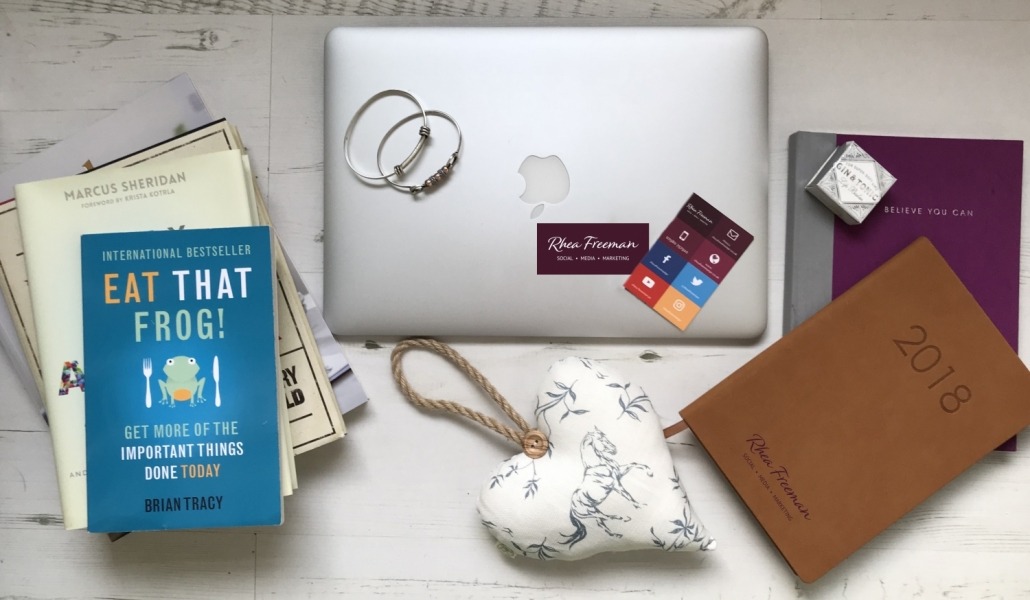
In my case, burgundy is my main colour, I have a sage green as a secondary colour, and do also have a blue too. And I use a lot of white. Of course you can also knock back the opacity of the colours you use too. And don’t forget the colour of your fonts- this is part of it. Mine is grey.
It’s a good idea to work with a pro when picking a colour palette for your brand or, if funds don’t allow, do a lot of reading and research. I genuinely love Fiona and find her knowledge on the matter incredible, so go and have a good read of her blog, follow her on social media and, if you can, buy one of her books or do an online course.
The other thing to note is that while colour and picking a colour palette for your brand is important, it shouldn’t stop you from actually launching a business. A nice font in a good colour is all you need to get going. Design shouldn’t stop you progressing with your business, far from it. It should help you further communicate your message and elevate your brand. Keep that in mind!