 Fonts can be a game changer when it comes to a logo or brand identity. In all honesty, the biggest change between my old logo and my new one is fonts that were used. Picking fonts to represent your brand can be challenging, but the good thing is that if you get the right one, it can make a HUGE difference.
How do you pick fonts to represent your brand?
I start with magazines, Pinterest and searching the web. There are a LOT of fonts available, a huge amount in fact. These go through fashions, like all design does, and more are being added all the time. There are a few different kinds of font family:
Serif type fonts – these are generally older style fonts and tend to have small lines at the tops and bottoms of the letters. A good example is the Word favourite Times Roman. When I say ‘older style’, there’s nothing wrong with using older style fonts at all. They can show heritage, knowledge and tradition when used correctly. Baskerville is a really nice example of a font that works really well today. You’ll see it’s classic and elegant but not old fashioned. Have a Google!
Sans Serif type fonts- sans means ‘without’ in French, so you’ll find a sans serif font doesn’t have the little extra bits. Generally these fonts are seen as a little bit more modern and feel a lot more curvy and round because there are no extra lines. This can make them feel soft and friendly too. Arial is a popular example of this (again, a Word favourite!), Avant Garde is another good one.
Script types fonts- should make you feel like they have a handwritten quality, even though they’re obviously more uniform than handwriting. They tend to flow and feel approachable too. The font I use for ‘Rhea Freeman’ is a hand lettering script font, but my previous one, Lobster, is also a Script font.
Decorative fonts- usually more elaborate than a Script font and can look incredible if used carefully. Some of the decorative fonts are not that easy to read (of course. some are!), but they should be used with caution in branding… in my opinion. Pick the right decorative font and it can work really well, but there are many caveats.
How to pick the fonts
So now you know the different font families (and it is useful because now you know what you’re Googling!), think about how you might use them. My logo is made up of two fonts – a premium handlettering font called Winsome and Oswald, and I use another font for my website copy. This means I can use these fonts in different ways on my website, social media graphics, etc etc. Size is important as, especially with a decorative or script font, if it’s too small, you won’t be able to see it. And if the person who is reading your website can’t actually read it, you might have the most beautiful font in the work and it won’t do the job!
But how do I know which fonts represent my brand?
Well, you need to think about the values of your brand, your customer avatar (and what they like and expect) and lots more. Some fonts sit better with different kinds of jobs – you’d expect a solicitor to have a very bold, easy to read, no nonsense font. This doesn’t mean it can’t be a premium font or even bespoke. This works with the values of the brand, the serious nature of the business and more. But if you’re an artist or more creative, a more decorative font can help you express your creativity in a way that doesn’t undermine your work… see what I mean?
A good place to start is to look at the kind of fonts that similar businesses use. You’ll probably see a pattern in the families they use and the styles. You don’t have to do the same, but it’s a useful reference point and place to start.
A word of warning about fonts
Less is more. There are so many beautiful fonts available that it can be really hard to pick which to use. The good news is you can use more than one font in your branding, but these need to a) work together and b) be limited. Too many fonts can confuse a message, and fonts that clash rather than complement can feel amateur and a bit manic… which no business wants!

 I adore the
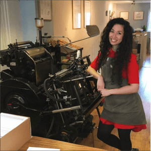 wedding stationery. The envelope and the lettering honestly blew me away. It was SO beautiful and so different. A little Harry Potter-esq. It was gorgeous. As a stationery junkie I had to find out more. Hell, I became absorbed in the world of Meticulous Ink and followed all their social media channels and drooled over their website and gorgeous stationery products for longer than I’d like to admit. I started talking about them to friends and family… and then I emailed Athena, the lady behind this amazing brand, to see if she’d like to participate in this blog. And she said yes. And I did a happy dance. And that’s not even an exaggeration. So here’s a few minutes with Athena Cauley-Yu. You’ll see from the pictures below, her stunning products and her story why I’m now more than a little obsessed.
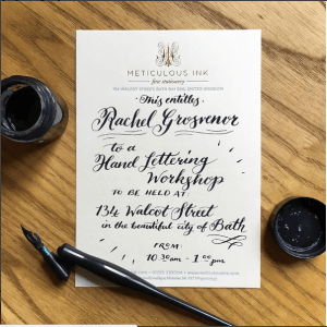 I grew up in North London and was raised by my mum, who would constantly leave subliminal encouragement in my vicinity as a child – things like self improvement books and fancy toy cars. My mum was very good in that way, and was always supportive in my desire to be creative. My first job was working on the phone in my father’s oriental take-away when I was 14 and I have worked ever since. At university I studied Arts & Media, as I was unsure exactly what I wanted to do, and it was a course full of variety. We got to choose classes from Fine Art, Digital Screen Arts, Photography, and Animation, then we’d whittle it down to just one subject to specialise in. I chose Fine Art Printing because nobody else used the enormous print studio at the university, so it was my own personal private studio! After university I worked at two private stationers in London before embarking on the great adventure of my own creative business.
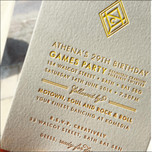 our name, so each and every printed item is individually checked by our small team to ensure it’s perfect in every way. It’s this tactile, hands-on approach that helps to get that